Master the art of mixing wood tones in 7 steps
Most clients have a number of pieces of furniture that they want to incorporate into their new space. Some of that furniture will be constructed of timber. It can be tricky to match particular timbers with new floors and other timber elements such as veneer walls etc. However , I stick to following seven rules which allows me to blend timbers within the space successfully.
DISCOVER THE DOMINANT TONE
First we have to look at the main tone of the timber. We usually split tones into cool and warm tones.
These cheat sheet from American site, Room and Board, is very helpful. Like makeup, timber has a distinct undertone. If you stick with either cool or warm tones - that is almost the battle won.
2. LIMIT USE TO 2 COLOURS AND USE ANOTHER AS A CONTRAST
I stick with 2 versions of the same tone throughout the interior and then add another one - either extreme dark or light (within the same tone) as a contrast.
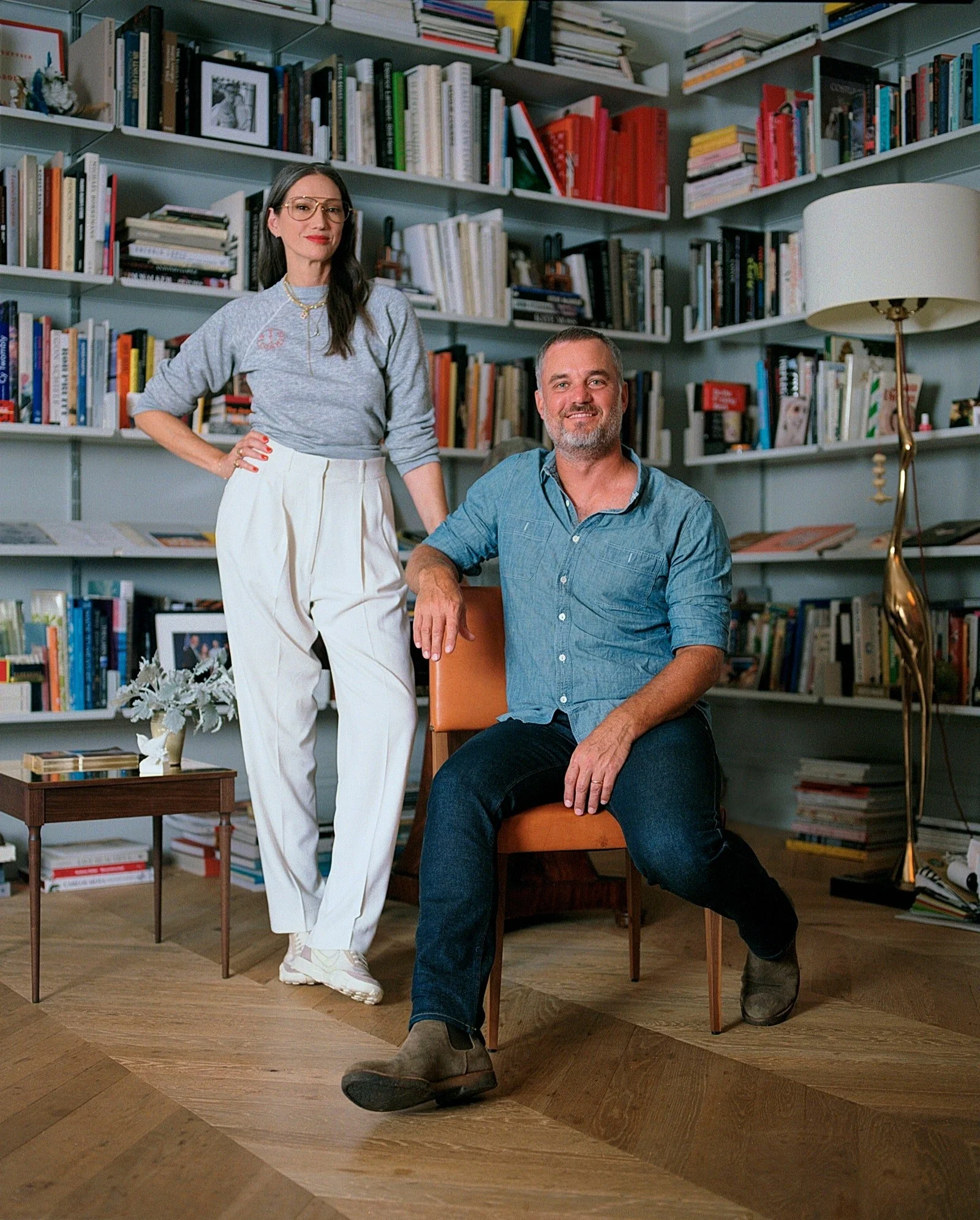
Jenna Lyons has just released a furniture collection with Roll and Hill. I love this image here from this months Architectural Digest. In a very subtle way, you can see how the oak floor has the same warm tone of the small table. Just as an aside , I am loving the Vitsoe shelving that I have in my own office- I thought mine was big but now I have shelf envy.
3. If in doubt…contrast
Ok - you’re not sure…just stick with the tones but go REALLY dark or REALLY light.
Love this image from Est Living. Here we can see the cool light tones of the kitchen cabinets mixed with the darker tones of grey oak floor. The very dark sofa, ventilation grilles , tapware and accessories also plays up the contrast.
Here’s another use of contrast via Est Living.
4. Use similar tones through the space
One of the key design tricks is to use the same colours repetitively throughout the space and throughout the project. It could just be detail such as a throw pillow , even down to a piece of glass on a book shelf. It’s fun to look for objects that carry through your colour scheme.
5. If you are using timber on your ceiling - it should match the floors
Ensure if you decide to use timber detailing on your ceilings , whether it be battens or beams, it should be similar in tone to your floors. A stark contrast can make the interior seem bottom or top heavy.
Again from Est Living- look at the timber of the floor and the ceiling. This is also an example of how the warm colours of the armchairs don’t gel well with the rest of the interior. Love the style - hate the mix.
6. break up the wood
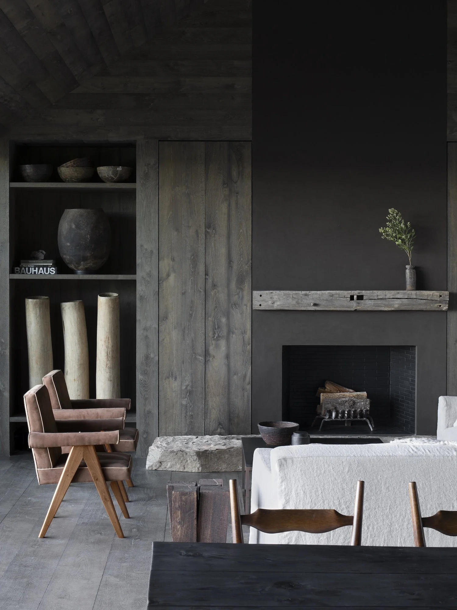
I do like the interior above but it is a lot of wood. I always break up the wood with a bit of textile or stone - whether it be a rug thrown on a floor, or luxurious stone, metal or a velvet or silk, some contrast of material always looks right and ensures you don’t get that ‘matchy matchy’ vibe.
7. textured & smooth
Use woods of the same tone but different finishes. You want your interiors to delineate the space not make it look seamless. It is differences in texture that can influence light and shade and looks interesting to the eye. Remember an interior is not just what it looks like, but also how it makes you feel and the memories that it may evoke.


